Designing Apple Wallet Passes: Text Alignment, Layout, and Behavior

Updated November 10, 2025
TL;DR: How text rendering works
- 1. Text alignment
- 2. Pass style
- 3. Truncation
- 4. Dynamic text sizing
- 5. Row control
Overview
Apple Wallet passes may look simple, but their layout is governed by strict rules. Designers and developers often find that fields don’t land where expected, labels get cut off, or font sizes change unexpectedly. This tutorial explains how Apple Wallet handles field alignment, stacking, truncation, and text sizing—and how to design passes that look clean and behave predictably.
What is field alignment in Apple Wallet
Each field in a pass can include a textAlignment setting. The available options are Left, Center, Right, and Natural. Natural alignment follows the direction of the language or script. These settings only affect how the text appears inside the field box—they do not move the field itself.
For example, setting a field to Right alignment will push the label and value to the right edge of its box, but the box itself stays in its default position. Designers should use alignment to fine-tune the visual balance of text, not to reposition fields. Field placement is determined by the order of fields in the pass definition.
Each field object in a pass (primaryFields, secondaryFields, auxiliaryFields, etc.) can include a textAlignment key. The allowed values are:
- Alignment Left
- Alignment Center
- Alignment Right
- Alignment Natural (aligns based on language/script direction - default)
How does Apple Wallet stack fields
Auxiliary fields are displayed horizontally in a single row by default. If you add multiple, Wallet will try to fit them side by side. How Apple Wallet really stacks fields:
- Primary fields → the big, bold row in the center.
- Secondary fields → directly beneath the primary, usually 1–2 fields side‑by‑side.
- Auxiliary fields → on the same horizontal band as secondary, not strictly “beneath.” They’re often shown in the same row or immediately adjacent depending on device width and number of fields.
- Back fields → only visible when you flip the pass. So if you expected auxiliary fields to always appear as a distinct “row under secondary,” that’s not guaranteed.
Apple’s renderer tries to optimize space: On narrow screens, auxiliary fields may appear below secondary. On wider screens, they can appear in the same horizontal band, giving the impression they’re “next to” secondary rather than “beneath.”
How do pass styles affect layout
You cannot manually drag fields into new positions. Instead, you choose which array each field belongs to—primary, secondary, auxiliary, or back. Understanding this hierarchy helps you decide where to place key information so it remains visible and uncluttered across devices.
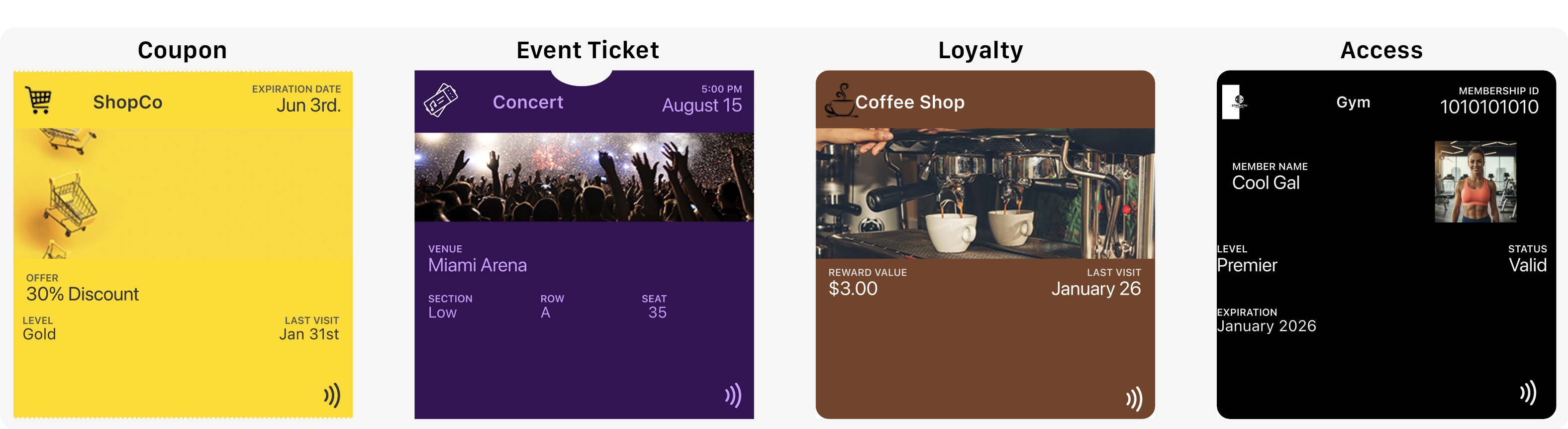
Different pass styles change how fields are arranged.
- Coupon and Access passes stack secondary and auxiliary fields in separate rows.
- Loyalty Store cards often merge these fields into a single band beneath the primary.
- Event tickets prioritize readability by stacking secondary and auxiliary fields vertically.
This means the same field configuration can look different depending on the pass type. Designers should choose a style that matches their layout goals. For example, event tickets are ideal when clarity is essential, while coupons work well for minimal, promotional layouts.
How can you control rows on event ticket passes
Event tickets offer a unique feature: row control for auxiliary fields. With event tickets, you can have multiple auxiliary rows. Each auxiliary field can be assigned to either row 0 or row 1. Row 0 places the field in the first auxiliary row, while row 1 places it in the second. Each row can display up to four fields side by side.
This lets you group related information clearly. For example, you might place Date and Time in row 0, and Section and Seat in row 1. This keeps the pass readable and avoids cramming too much into one line. Other pass styles do not support row control—Wallet decides layout automatically for store cards, coupons, and generic passes.
What happens when labels or values are truncated
Apple Wallet automatically truncates text that is too long. There is no wrapping or scrolling. Primary fields can hold around twenty characters, while secondary and auxiliary fields allow fewer. The exact cutoff depends on layout and adjacent fields.
To avoid truncation, keep labels short and test passes on real devices. Simulators may not match Wallet’s behavior exactly. Use concise labels like “Member ID” instead of longer phrases. This helps maintain readability and ensures important data isn’t lost.
Why does text size vary
Apple Wallet controls font size automatically. Designers cannot set custom fonts or sizes. The system adjusts text size to fit the field box. Generic passes allow slightly larger text with more spacing. Store cards and coupons compress text more aggressively. Event tickets keep text larger and stacked for clarity.
When multiple fields share a row, Wallet may shrink text to balance them evenly. Longer values appear smaller, while shorter values appear larger. This adaptive behavior ensures legibility across devices and languages. Designers should preview passes on different devices to confirm how text will render.
What are the key takeaways
Text alignment affects how content appears inside a field, not where the field is placed. Field stacking depends on pass style, and auxiliary fields may share a row with secondary fields or appear beneath them. Event tickets are the only pass type that supports row control. Truncation happens automatically, and text size adjusts dynamically based on content and layout.
Designers should plan for these behaviors and use them to their advantage. Choosing the right pass style and organizing fields carefully helps ensure a clean, readable layout.
What are practical design tips
Use short, clear labels and values. Choose a pass style that matches your layout goals—generic for flexibility, store card or coupon for compactness, and event ticket for clarity. Split information across arrays to avoid overcrowding. Place the most important data in primary fields. Always preview passes on actual devices to catch layout issues early.
These tips help you design passes that look polished and behave predictably. By working within Wallet’s constraints, you can create a better experience for users.
Making NFC easy with PassNinja
PassNinja makes it simple to create and distribute Apple Wallet passes with NFC support. Instead of wrestling with JSON formatting or layout quirks, you can use PassNinja’s APIs to generate passes that follow Apple’s rules. This saves time and reduces errors.
With PassNinja, you can build loyalty cards, coupons, and event tickets that update dynamically and support tap-to-redeem experiences. Designers can focus on branding and layout, while developers handle integration with confidence. PassNinja ensures your passes are compliant and optimized for Wallet’s renderer.
Conclusion
Apple Wallet passes follow a strict design system. Field alignment, stacking, truncation, text sizing, and row control are all handled by Apple’s renderer. Designers can’t override these rules, but they can plan around them. Choosing the right pass style, keeping labels short, and testing on devices are essential steps.
By combining these best practices with PassNinja’s tools, teams can deliver NFC-enabled passes that look great and work reliably. The result is a smoother experience for users and a faster path from design to deployment.