
Updated March 26, 2026
TL;DR: Interaction design in wallet passes is not about what users do — it's about what the system does for them.
- You can't add buttons, flows, or gestures. That's intentional.
- Three moments you control: recognition, validation, update response
- The best interaction is often no interaction at all
- Passes interact through state changes, not user control
Overview
In wallet passes, interaction design is not about what users do. It's about what the system does for them.
You cannot add buttons. You cannot create flows. You cannot design taps and swipes.
What you can design: the moment the pass appears, what it shows, and what happens after validation. That's it. That's the entire interaction surface.
The interaction you don't control
Designers trained on apps expect to design interaction. In wallet passes, most interaction is designed by Apple and Google.
The lock screen appearance? System decision. The notification timing? System decision. The validation flow? System decision.
Your job is not to design interaction. Your job is to design for the moments the system creates.
Why is interaction in wallet passes intentionally minimal
Wallet passes are not designed for exploration. They are designed for decisive actions: scan, tap, show, confirm.
Every allowed interaction exists to support speed, clarity, and confidence. Anything that slows that down is intentionally excluded.
Why is the primary interaction often not a tap
In many wallet pass experiences, the main interaction is passive. The pass is surfaced automatically, the correct code or credential is already visible, and the user does nothing except present the phone.
This is a radical departure from app interaction models. The best interaction is often the one that doesn't require a decision.
What are the core interaction types you can design for
Wallet passes support a small but powerful set of interaction patterns.
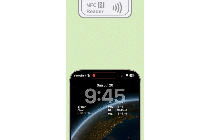
How does the presentation interaction work
The most common interaction is simply showing the pass — a barcode, a QR code, or an NFC credential. The user's role is minimal. The system handles the rest.

Make it unmistakably clear what is being presented and why. When a QR code or credential is the primary interaction, it should be treated as a first-class system element — not embedded inside decorative imagery.
How does tap to reveal work for secondary information
Wallet passes support a clear separation between what must be visible immediately and what can be accessed intentionally. This is often implemented through the back of the pass.
On the back of a pass, you can typically include supporting text, terms or instructions, and a URL for help, policies, or next steps. This information is not meant for the critical moment — it's there when the user chooses to look deeper.
If information is required for validation or access, it does not belong on the back.
How do app links and external actions work
Wallet passes can include a dedicated app link interaction. This link is commonly used to open a branded app, deep-link into a specific screen, or resume a journey outside the wallet.
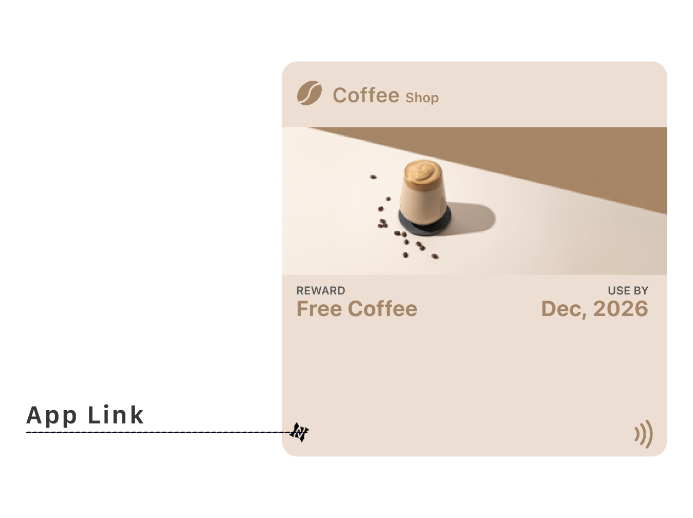
Importantly, this interaction is flexible. If an app is installed, it can open directly. If not, it can fall back to a web experience. This makes the pass a bridge, not a destination.
App links should support continuity, not replace the pass's core function.
What expanded interactions do poster passes support
Some pass types support richer interaction patterns. Poster-style event passes unlock an additional layer of interaction: an expanded, guided experience with structured secondary views and event-related context.
This is often referred to as an event guide experience. These interactions are still constrained, but they allow more depth, more storytelling, and more contextual navigation.
Even with expanded interaction, the primary moment — entry, validation, access — must remain frictionless.
How do system-driven interactions work
Some interactions are initiated by the system, not the user. Automatic surfacing, lock screen suggestions, and notifications triggered by updates all fall into this category.
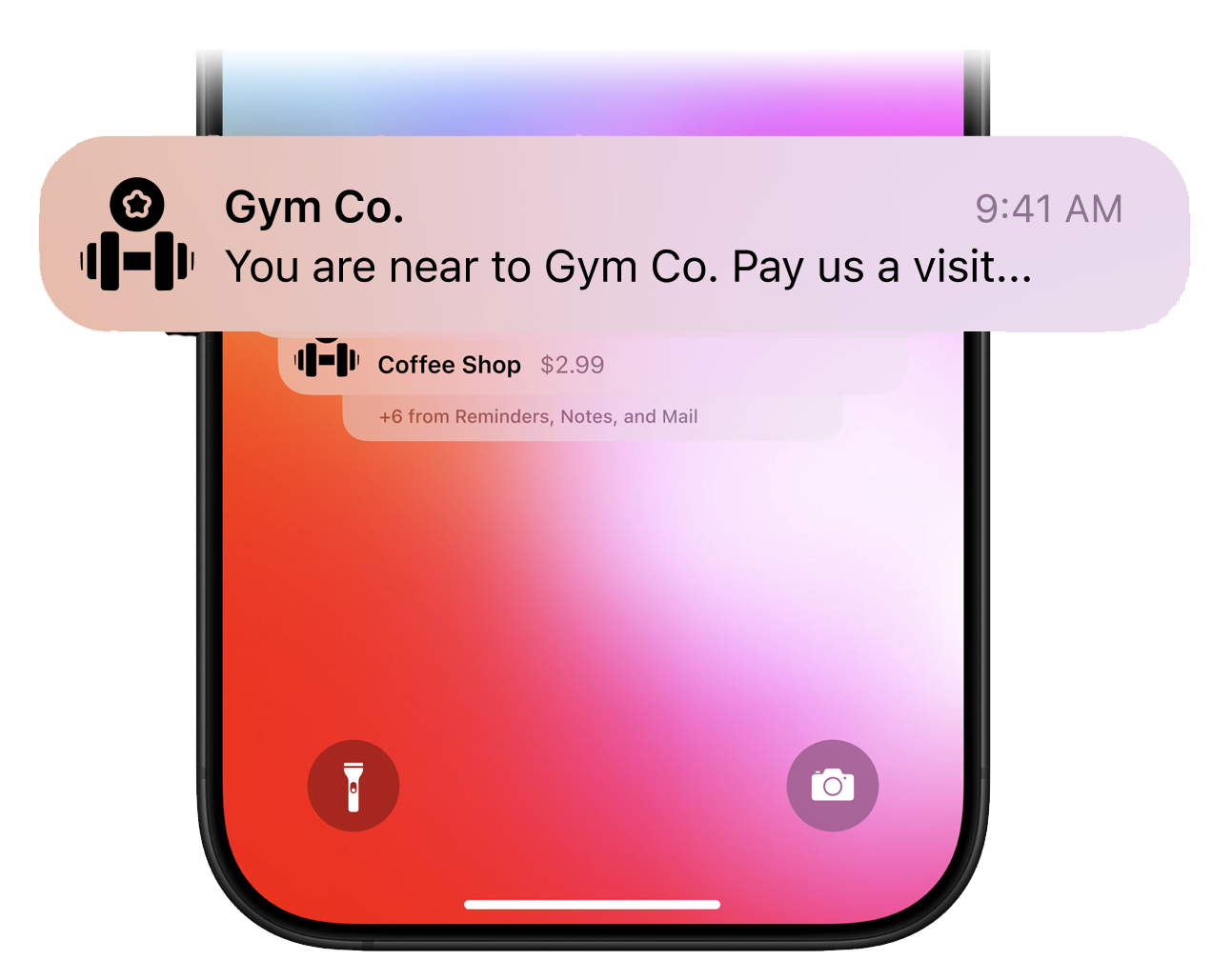
The user did not ask for these interactions, but they benefit from them. Design content so these moments make sense instantly, without explanation.
What interactions should you avoid designing
Wallet passes intentionally avoid multi-step flows, custom gestures, user configuration, form input, and navigation trees.
If your experience depends on these, a wallet pass is the wrong surface. Wallet passes are endpoints, not processes.
Why is interaction shaped by trust
Wallet passes work because users trust them. They trust the system UI, the predictable behavior, and the automatic updates.
Every interaction should reinforce that trust. Too many actions, links, or choices undermine confidence.
How do you design for no interaction
One of the hardest shifts for designers is accepting that users may never tap, never explore, and never "engage" — and that's success.
If the pass appears at the right time, shows the right information, and requires no explanation, then the interaction design has worked.
How do passes interact through state changes
Wallet passes interact with users primarily through state changes: active to expired, locked to unlocked, pending to confirmed, upcoming to live.
The user doesn't trigger these changes — they observe them. Make state changes obvious and meaningful.
What is a useful design test for interactions
If you're unsure whether an interaction belongs in a wallet pass, ask: Would this still work if the user never tapped anything?
If the answer is no, the interaction probably doesn't belong there.
The Shift
Stop designing interactions. Start designing for moments the system creates.
The pass appears. The credential is ready. The user shows. The system validates. Done.
If your pass requires explanation, navigation, or decision — the interaction design has failed. Success looks like nothing happening at all.
More articles in Foundations
Most teams design wallet passes wrong. Not because they lack skill — because they bring the wrong...
Designing for Pass UpdatesA customer just made a purchase. They open their wallet. The loyalty balance is the same as yeste...
How Wallet Passes Are Surfaced by the OSA wallet pass that's never surfaced is a wallet pass that doesn't exist.
Information Hierarchy in Wallet PassesYou have one second.
Introduction to Designing Wallet PassesThe design looked perfect in Figma. Clean layout. Beautiful typography. Exactly what the brand wa...
Wallet Pass Design LimitationsConstraints are not limitations. They are the design system.
Wallet Pass Design Principles ChecklistEvery failed wallet pass violates one of these principles. Every successful pass embodies them.
Wallet Passes vs Apps vs WebsitesApps invite exploration. Websites enable discovery. Wallet passes demand instant recognition.