
Updated March 26, 2026
TL;DR: One pass, two platforms. The trap is making them look the same. The goal is making them both correct.
- Start with meaning, not layout — meaning survives platform differences
- Define a shared core: identity, entitlement, state, validation
- Let each platform express the core differently
- Avoid the "lowest common denominator" trap — it produces bland passes
- Accept asymmetry where it improves outcomes
- Test against real moments, not screenshots
- One pass, two expressions. That's the goal.
Overview
Designing one pass for two platforms sounds efficient. It's actually one of the hardest problems in wallet design.
The trap: teams try to make both platforms look the same. This fails because Apple and Google don't want the same thing.
The solution: design a shared core of meaning, then let each platform express it differently.
The mistake that wastes every cross-platform effort
Teams spend weeks trying to make Apple Wallet and Google Wallet passes look identical.
They adjust image sizes. They fiddle with field alignment. They chase visual parity.
And the passes still feel wrong on both platforms.
The mistake is treating visual matching as the goal. The goal is behavioral equivalence — both passes doing their job correctly in their native systems.
Why should you start with meaning instead of layout
Cross-platform wallet design should never start with pixel alignment, visual symmetry, or identical field placement. Those goals are fragile and usually fail.
Instead, start with what the pass represents, what moment it serves, and what outcome matters.
Meaning survives platform differences. Layout does not.
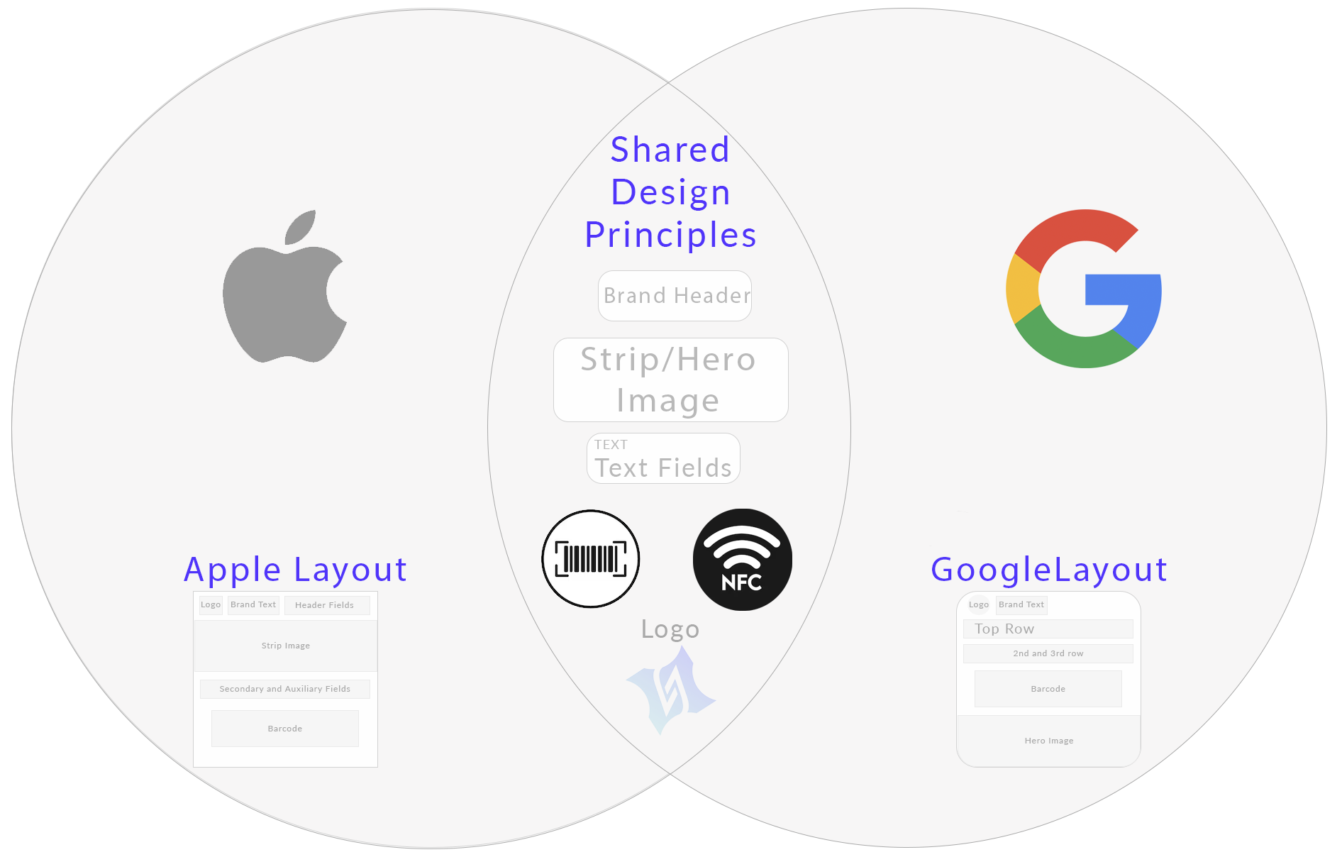
What is a shared core and why does every cross-platform pass need one
Every successful cross-platform pass has a shared core consisting of identity, entitlement, state, and validation logic.
This core should be platform-agnostic, clearly defined, and stable over time.
If the core is unclear, no amount of design adjustment will fix it.
| Core Element | Purpose | Platform Behavior |
|---|---|---|
| Identity | Who or what the pass represents | Expressed through branding and primary fields |
| Entitlement | What the holder can do or access | Shown in credential zone and primary display |
| State | Current status (valid, expired, used) | Dynamic fields and update notifications |
| Validation | How the pass is verified | Barcode, QR, or NFC implementation |
How do Apple and Google express the same core differently
Once the core is defined, each platform expresses it through its native design language.
Apple Wallet expresses the core through hierarchy and authority. Layout is fixed, typography is controlled, and visual consistency reinforces trust.
Google Wallet expresses the core through structure and integration. Data drives presentation, and the pass participates in a broader ecosystem of services.
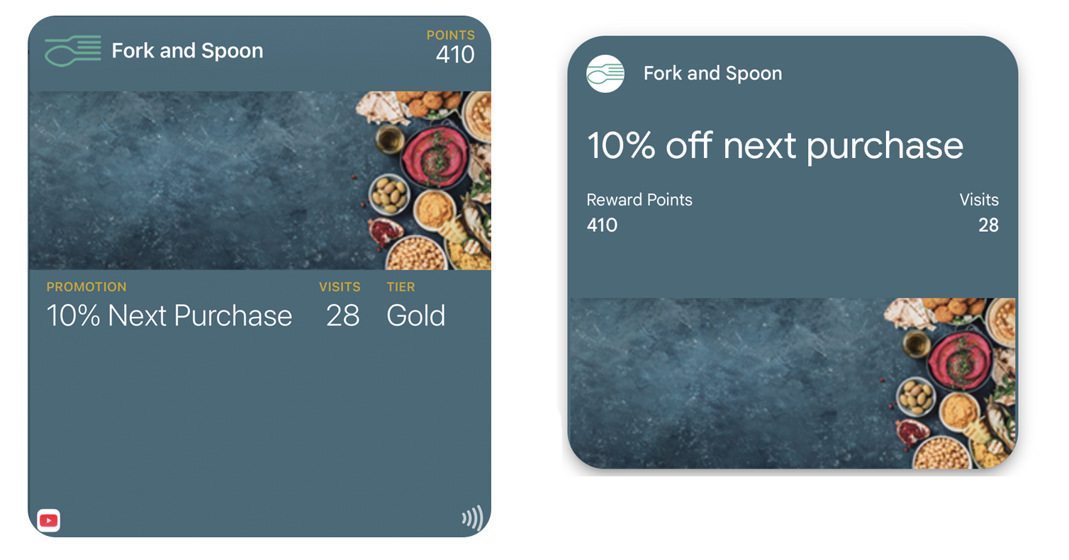
Trying to force identical expression weakens both platforms. Design equivalence is about outcome, not appearance.
How should validation be handled across platforms
Validation is where platform differences become most visible.
Apple Wallet favors native presentation, emphasizes reliability, and minimizes ambiguity. The credential zone is protected and optimized for scanning.
Google Wallet favors system interoperability, depends on external confirmation, and emphasizes backend truth. Smart Tap enables seamless NFC validation.
Design validation once, but respect how it is executed differently on each platform.
The lowest common denominator trap
The obvious approach: design only for features both platforms share.
This produces bland passes. You ignore Apple's visual authority. You ignore Google's data flexibility. You design for neither platform's strengths.
Better approach:
- Define the shared core: identity, entitlement, state, validation
- Design that core strongly
- Let each platform express the core with its native strengths
- Accept that the passes will look different — but feel equivalent
Asymmetry is not inconsistency. A feature that only makes sense on Apple should only appear on Apple. Forcing uniformity creates mediocrity.
Why should you test against real moments instead of screenshots
Cross-platform success is not visual parity. It is both passes scanning reliably, both passes surfacing when needed, and both passes being understood instantly.
If the moment works on both platforms, the design works. Screenshots can look identical while behavior diverges completely.
Why is documenting differences explicitly so important
One of the most overlooked steps in cross-platform pass design is documenting where behavior diverges, explaining why it diverges, and setting expectations early.
This prevents teams from "fixing" differences that are actually intentional. When stakeholders understand that platform asymmetry is by design, they stop requesting impossible parity.
What mental shift makes cross-platform design work
Stop thinking: "How do we make these look the same?"
Start thinking: "How do we make these behave correctly in their own systems?"
That shift unlocks better decisions. When you optimize for correct behavior rather than visual matching, you design passes that feel native on both platforms.
The Shift
Stop asking: "How do we make these look the same?" Start asking: "How do we make these both correct?"
When you optimize for platform-correct behavior rather than visual matching, you design passes that feel native on both platforms — even when they look different.
One pass, two expressions. That's the goal.
More articles in Platform Guides
Every design difference between Apple and Google Wallet traces back to one choice:
Apple Wallet Design System ExplainedApple Wallet is not a design tool. It is a policy engine.
Apple Wallet Layout AnatomyLayout in Apple Wallet is semantic, not spatial.
Designing Apple Wallet Passes: Text Alignment, Layout, and BehaviorYou cannot control how text looks in Apple Wallet. You can only control what it says.
Google Wallet Design System ExplainedGoogle Wallet doesn't hold credentials. It connects systems.
Google Wallet Layout Behavior & Visual FlexibilityGoogle Wallet's flexibility is not an invitation to design freely. Flexibility demands defensive ...