
Updated March 26, 2026
TL;DR: You have one second. Hierarchy decides if you succeed.
- One second — that's how long users give a pass to explain itself
- Header is everything — it's all users see when passes are stacked
- Primary answers: What is this? Is it valid? Secondary supports without competing.
- If hierarchy doesn't answer instantly, nothing else matters
Overview
You have one second.
When a wallet pass appears — on a lock screen, in a stack, at a scanner — the user gives it one second. In that second, they must know: What is this? Is it valid? What do I do?
If hierarchy doesn't answer those questions instantly, nothing else matters.
Hierarchy matters more here than anywhere else
In apps and websites, users can recover. They can scroll, tap, and navigate. In wallet passes, they usually can't.
The OS surfaces a pass briefly, often under time pressure. Users glance, decide, and move on. Hierarchy is not about beauty here — it's about speed and certainty.
The one-second rule
When a wallet pass appears, the user typically gives it about one second. In that second, they must be able to answer: What is this? Is it mine? Is it valid right now?
If hierarchy doesn't make those answers obvious, nothing else matters.
The header: the only thing users see in stacks
When passes are stacked in the wallet, only the header is visible. The logo and header text are the only elements users see when browsing their passes. Everything below the header is hidden until the pass is expanded.
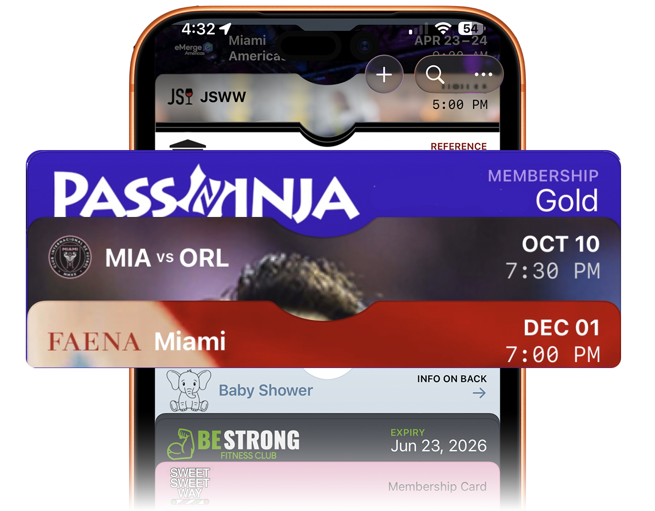
This makes the header the single most important real estate on any pass. The logo must be instantly recognizable. The header text must identify the pass clearly — the brand name, organization, or pass purpose.
If a user cannot identify your pass from the header alone, they may never tap to expand it. The header is not just branding — it is the gateway to the entire pass. Design it for recognition, not decoration.
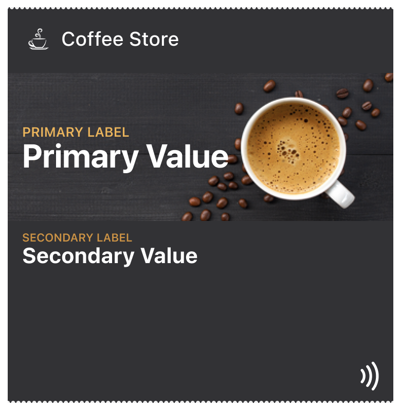
Primary information: the reason the pass exists
Primary information is the reason the pass exists. Examples include an access status, a ticket or entitlement, a membership level, a balance or remaining value, or a credential ready to be scanned or tapped.
Primary information must be immediately visible, unambiguous, and stable across updates. If users have to search for this, the hierarchy is wrong.
Secondary information: support without competition
Secondary information adds clarity, not distraction. Examples include dates and times, locations, seat or zone details, usage limits, and supporting labels.
Secondary information should reinforce the primary message, never compete for attention, and be readable without overpowering. A common mistake is treating all data as equally important. Hierarchy demands restraint.
Contextual information: what can wait
Some information is useful — but not in the critical moment. This is where the back of the pass, secondary views, and supporting text belong.
Examples include terms and conditions, instructions, policies, help links, and URLs. If information is required for validation or access, it does not belong here.
How do stable and dynamic fields differ
Hierarchy is also temporal. Every pass has stable fields that define identity and dynamic fields that reflect current state.
Stable fields should change rarely, anchor recognition, and help users reorient instantly. Dynamic fields should change meaningfully, signal state transitions, and be visually distinct when updated.
Designing everything as dynamic creates confusion.
How should you design for update visibility
When a pass updates, hierarchy decides whether the update is understood.
Good hierarchy makes changes obvious, keeps identity intact, and highlights what matters now. Bad hierarchy changes too many fields, forces re-reading, and makes the pass feel unfamiliar.
Updates should feel like evolution, not replacement.
Why does hierarchy come before branding
Branding supports hierarchy — it does not replace it. Colors, logos, and imagery should frame information, establish identity, and never compete with meaning.
If branding draws attention away from the primary message, it is working against the pass.
How do poster passes handle deeper hierarchies
Some pass types allow more depth. Poster-style event passes can support layered content, guided secondary views, and event-specific context.
Even then, the rule holds: the primary moment must remain frictionless, and deeper hierarchy must not delay validation. More space does not mean more importance.
What is a practical hierarchy test
Before finalizing a pass, ask: If only one thing were visible, what would it be? Then ask: If two things were visible, what comes second?
If the answers are unclear, the hierarchy isn't done yet.
Where hierarchy breaks
Common mistakes include emphasizing branding over status, burying the credential, updating too many fields at once, treating informational text as primary, and designing for reading instead of recognition.
Most failed passes are technically correct — but hierarchically wrong.
How does hierarchy create confidence
Good hierarchy creates confidence for users, for staff scanning passes, and for systems validating them. The pass feels obvious. The interaction feels smooth. The outcome feels certain.
Why is hierarchy the keystone of pass design
Everything in wallet pass design points to hierarchy. Constraints define the canvas, surfacing defines the moment, interaction defines the action, and updates define change. Hierarchy defines whether any of it works.
The Shift
Stop designing passes. Start prioritizing information.
Ask: If only one thing were visible, what would it be? Then ask: If two things were visible, what comes second?
When you can answer those questions, hierarchy is done. When you can't, no amount of visual polish will save the pass.
More articles in Foundations
Most teams design wallet passes wrong. Not because they lack skill — because they bring the wrong...
Designing for Pass UpdatesA customer just made a purchase. They open their wallet. The loyalty balance is the same as yeste...
How Wallet Passes Are Surfaced by the OSA wallet pass that's never surfaced is a wallet pass that doesn't exist.
Interaction Design in Wallet PassesIn wallet passes, interaction design is not about what users do. It's about what the system does ...
Introduction to Designing Wallet PassesThe design looked perfect in Figma. Clean layout. Beautiful typography. Exactly what the brand wa...
Wallet Pass Design LimitationsConstraints are not limitations. They are the design system.
Wallet Pass Design Principles ChecklistEvery failed wallet pass violates one of these principles. Every successful pass embodies them.
Wallet Passes vs Apps vs WebsitesApps invite exploration. Websites enable discovery. Wallet passes demand instant recognition.