
Updated March 26, 2026
TL;DR: Access is not understood. Access is trusted — or not. Hesitation breaks everything.
- Access passes control real-world entry — hesitation breaks everything
- The problem is not usability — it is trust
- The access triangle: WHO, WHERE, WHEN must align instantly
- Design for the 2AM security guard, not the trained receptionist
- Status must be obvious: ACTIVE, SUSPENDED, EXPIRED, RESTRICTED
Why Access Fails
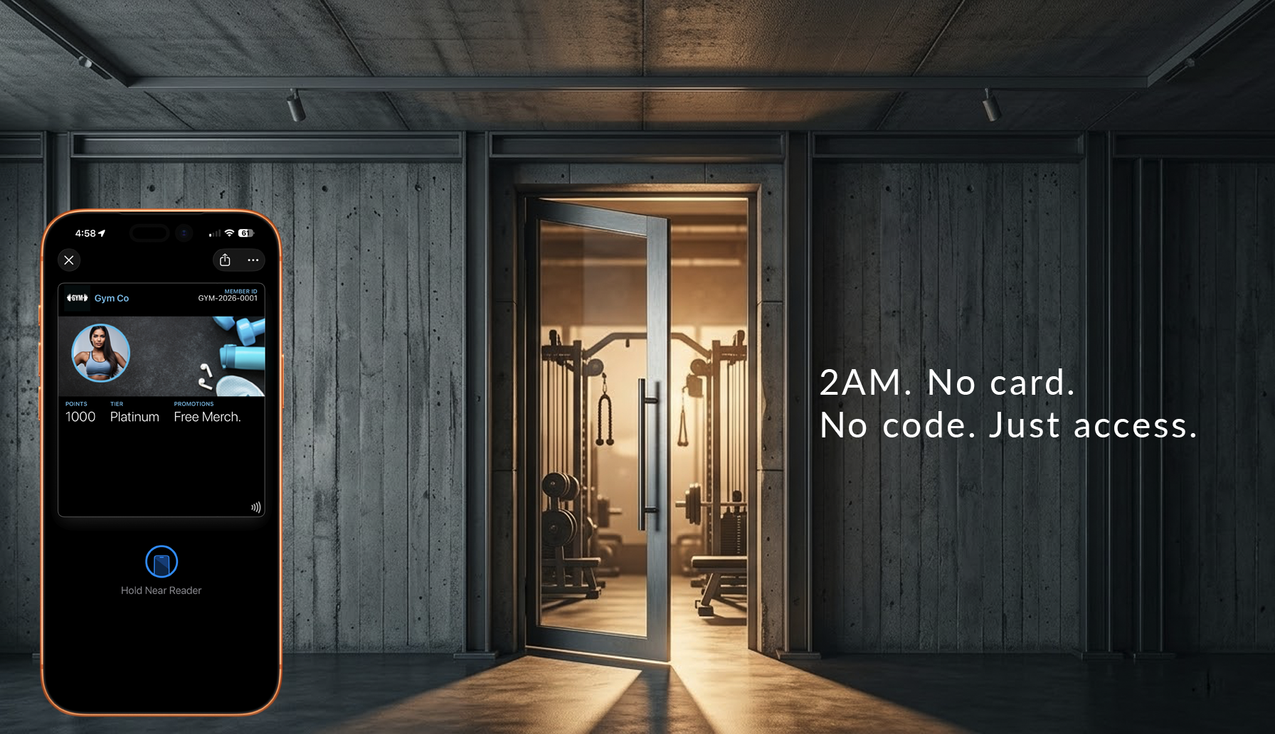
A person approaches the door at 2AM. The guard looks at the screen. The pass is unclear. The guard hesitates.
In that moment, the system has already broken.
Access systems cannot fail quietly. A broken layout in an app is an inconvenience. A broken access pass stops people at the door. Unlike digital systems that users can retry or work around, physical access traps people on the wrong side of a door.
The trust problem
Access passes don't control doors. They establish trust.
At the entrance, there is one question: "Is this person allowed — right now?"
The answer must be instant. If there is hesitation, trust breaks. If trust breaks, the system fails.
Not visually. Operationally. Lines slow. Decisions become inconsistent. Staff override the system.
Access is not about information. It is about certainty.
The interpretation problem
When a pass requires interpretation, it has already failed.
Interpretation takes time. Time creates hesitation. Hesitation erodes trust.
At a venue entrance:
- A staff member glances at the pass
- They pause
- They look again
- They call someone
The pass design did not fail visually. It failed operationally.
Good access design removes interpretation entirely. Valid or not. Allowed or not. One glance. No thought.
The Architecture
Access passes represent identity connected to validation systems.
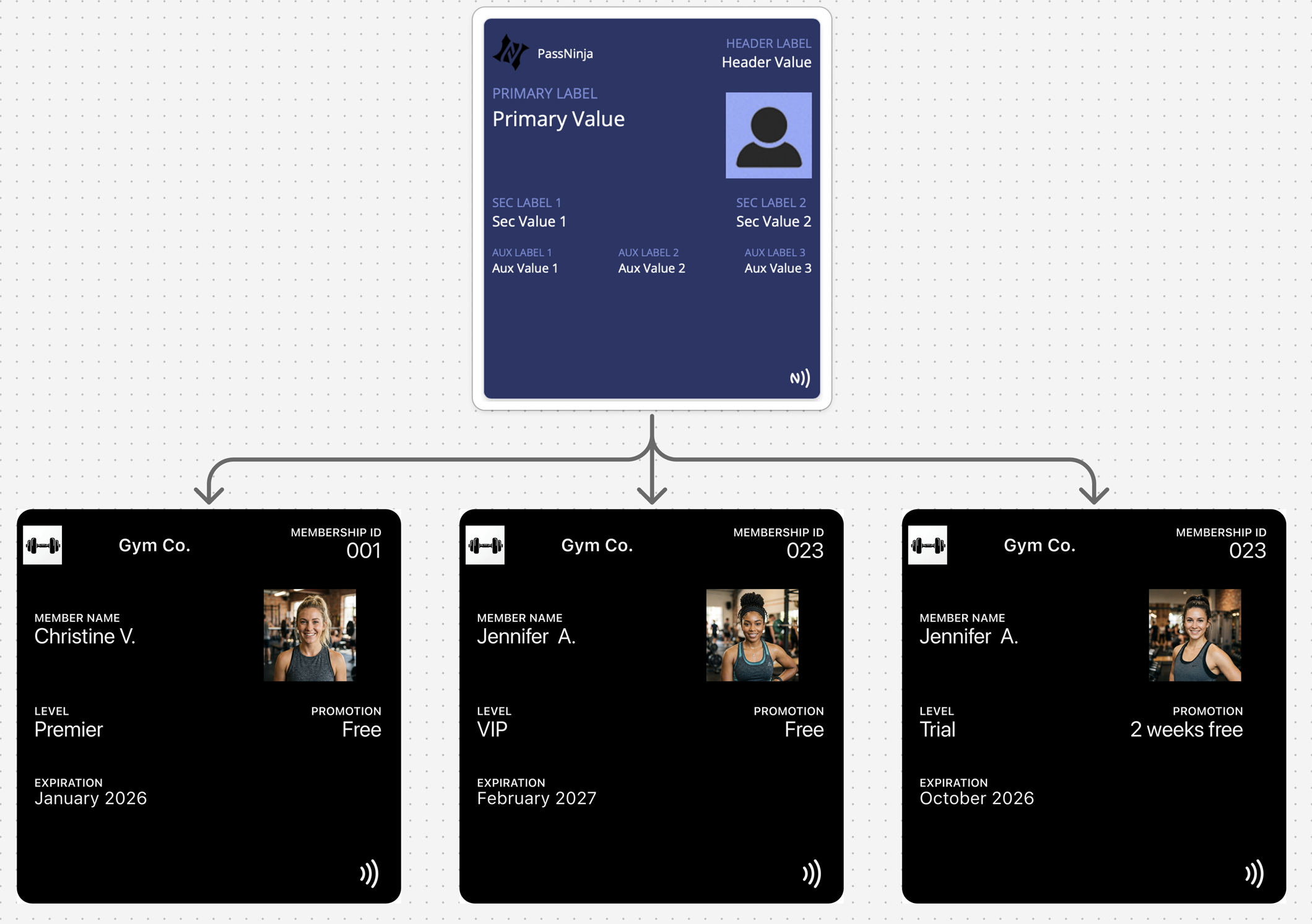
The two layers
Identity (Fixed)
- Name
- Organization
- Role or credential
- Visual identity
State (Variable)
- Active / inactive
- Valid / revoked
- Time-based permissions
- Usage status
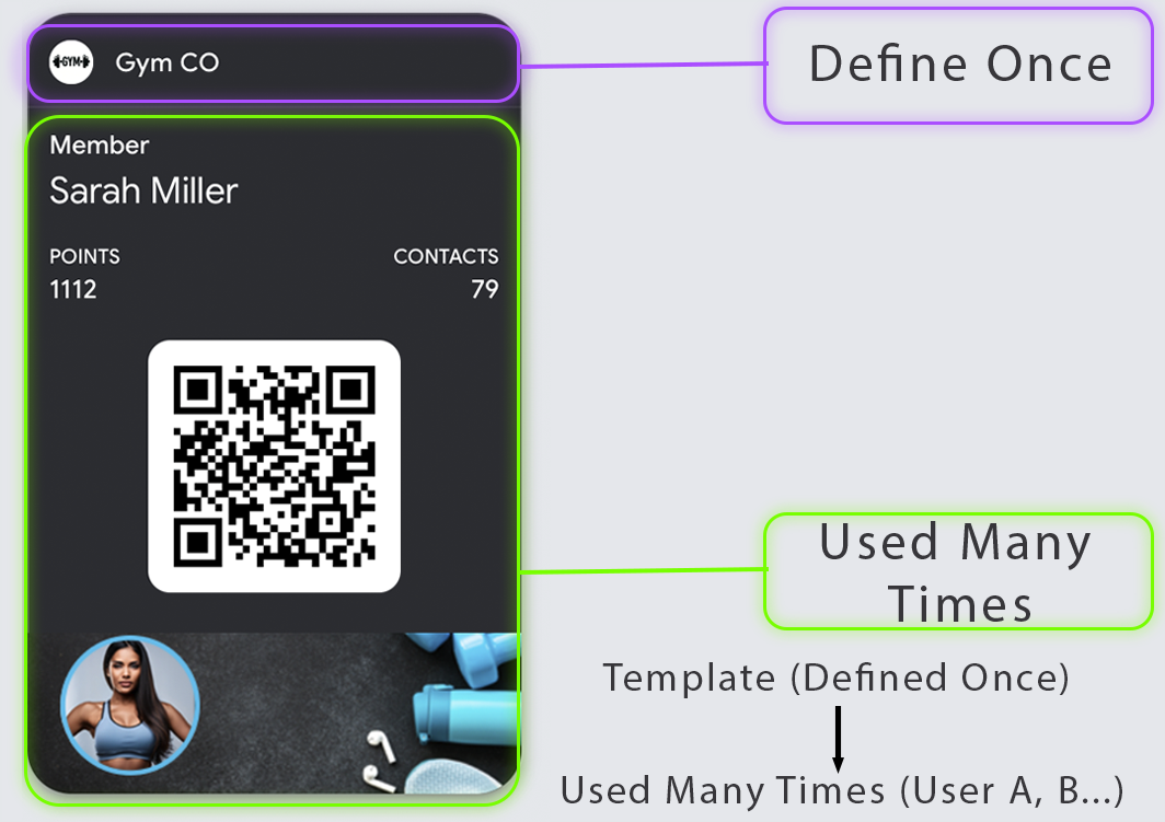
One identity definition, many credentials. One template, many passes. The pass reflects current authorization state.
The Access Triangle
Every access decision combines three factors:
- WHO — identity of the holder
- WHERE — zone, gate, or door being accessed
- WHEN — time window of validity
Your pass must make the triangle legible at a glance. A pass that shows WHO but hides WHERE and WHEN creates confusion. A pass that shows validity but not scope creates security gaps.
| Factor | Question | Display Requirement |
|---|---|---|
| WHO | Who is this person? | Name or identifier |
| WHERE | What can they access? | Zone, building, or door scope |
| WHEN | When is access valid? | Time window or schedule |
The 2AM Security Guard Test
Your access pass will eventually be shown to:
- A security guard on a night shift
- A contractor who's never seen your badge system
- A partner venue with no training on your passes
Can they make a grant/deny decision in 3 seconds?
If your pass requires explanation, context, or system access to interpret — it fails the test.
Design for the least trained person who will ever need to make this decision.
Validation
Access passes are where validation earns its keep. Visual-only access control invites misuse. Scannable credentials create audit trails and enable instant revocation.
NFC validation:
- Fastest flow when supported
- Lowest "aiming" friction
- Best for high-throughput entry points
- Enables Express Mode (Apple) for hands-free tap
QR/Barcode validation:
- Universal fallback
- Works with handheld scanners and phones
- Strong reliability when using native rendering
- Necessary backup when NFC hardware fails
Design for both "tap fails" and "scan fails" scenarios explicitly. The pass should guide users to the fallback credential when primary validation doesn't work.
State-Driven Design
Access is inherently state-driven. Permissions change, and the pass must reflect those changes:
State change moments:
- Access granted
- Access revoked
- Time window starts/ends
- Temporary hold applied
- Credential rotation
- Visitor pass created/expired
Access passes without updates become security liabilities. A revoked pass that still looks valid is a breach waiting to happen.
| State | Visual Treatment | User Action |
|---|---|---|
| Active | Clear "VALID" indication | Tap or scan to enter |
| Time-restricted | Show valid hours clearly | Check time before attempting |
| Suspended | Obvious suspended state | Contact for resolution |
| Revoked | Clear invalid indication | Contact or delete pass |
Decline State Design
People assume "valid" design matters most. In access control, decline design is equally important.
A good decline state:
- Is unambiguous — no confusion about whether access was denied
- Is not humiliating — the person is standing at a door, often with others watching
- Provides a next step — help desk location, phone number, or support link
Bad decline experiences create confrontations, slow lines, and damage relationships. Design the decline path with as much care as the success path.
Platform Reality
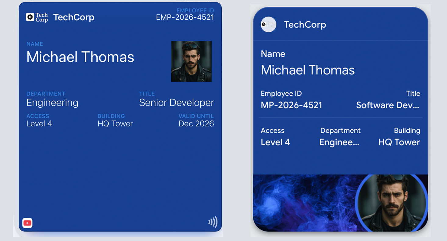
Both platforms enforce structure differently:
Apple Wallet: The layout is predefined. Identity is clearly presented. Status is communicated through controlled states. Express Mode allows access passes to work without unlocking the phone.
Google Wallet: The template is called a "Class." Identity is defined once, and the pass represents a credential. State changes based on backend validation. Smart Tap provides similar hands-free capabilities.
| Feature | Apple Wallet | Google Wallet |
|---|---|---|
| Pass type | generic (with NFC) | Generic |
| NFC support | Express Mode capable | Smart Tap capable |
| Location surfacing | locations array | Location-based notifications |
| Revocation | Remote void via update | API disable/delete |
Common Mistakes
Depending on visuals to indicate validity — Trust is built through clarity, not decoration. Visual effects cannot replace clear state communication.
Multiple credentials visible — "Which one do I use?" confusion at the reader. One primary credential, one fallback.
Vague access scope — No zone or time clarity. Users don't know where the pass works.
Burying restrictions in fine print — Time windows and zone limits should be visible on the primary view.
Relying on staff memory — "They'll know what VIP means" fails at scale. The pass must be self-explanatory.
No fallback when primary fails — NFC doesn't work, and there's no QR backup visible.
Ignoring the decline experience — Access denied with no guidance creates confrontation.
Treating the pass as the final authority — The pass is part of a decision, not the decision. Validation happens externally.
The Shift
Stop designing access passes for clarity. Start designing them for trust.
Clarity is necessary but not sufficient. Trust is everything.
If a staff member can decide in less than one second — the system works. If they pause — the system is already broken.
Remove interpretation. Remove hesitation. Remove the question.
That is access design.
More articles in Pass Type Design
A coupon that arrives late does not exist.
Designing Event TicketsEvent tickets are context-bound. The context is the event.
Designing Gift Card PassesA gift card isn't just stored value. It's a gift someone chose.
Designing Identity PassesIdentity passes prove who someone is. They don't grant access, trigger actions, or validate trans...
Designing Loyalty PassesLoyalty programs don't fail because they lack rewards. They fail because they disappear at the ex...
Designing Membership PassesA membership pass must survive the front desk moment — with untrained staff, busy lines, and memb...
Designing Poster / Enhanced Event TicketsEvery creative team asks the same question:
Designing Stored Value & Balance PassesStored value passes track units — sessions, visits, credits, punches, rides, meals.