
Updated March 26, 2026
TL;DR: Experience amplifies or destroys clarity. There is no middle ground.
- Two layers: entry (non-negotiable) and companion (optional depth)
- The amplification test: every element either helps clarity or competes with it
- If Layer B harms Layer A, you built a poster, not a ticket
- Nothing critical lives exclusively in the enhanced view
- Visual richness that undermines clarity is architectural failure
Why Enhanced Tickets Fail
Every creative team asks the same question:
"Can we make this ticket more engaging?"
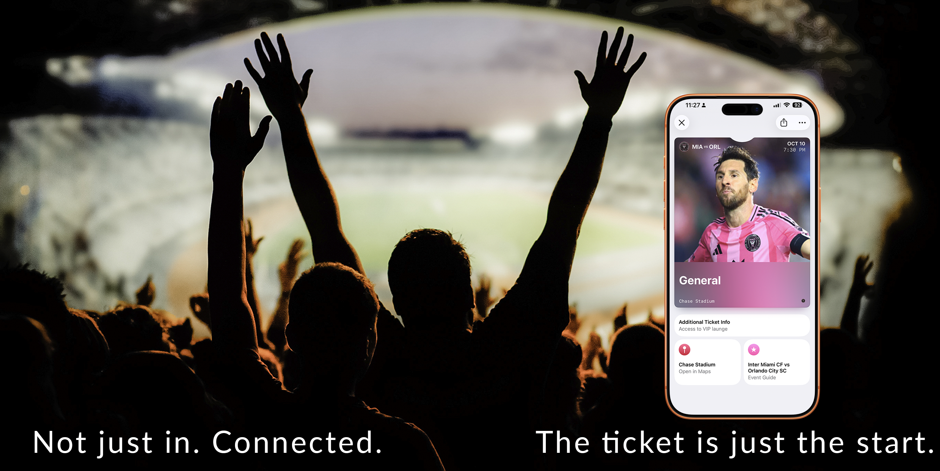
Then they add hero images, backgrounds, rich visuals. And the ticket looks better.
But at the venue entrance, it fails.
Not visually. Functionally. The scanner struggles. The staff hesitates. The line slows.
This is the paradox of enhanced tickets: The more you add, the more you risk.
Experience
Poster tickets are not "better-looking tickets." They are tickets with an experience layer.
That layer can:
- Build anticipation
- Create emotional connection
- Reinforce event identity
Or it can:
- Obscure critical information
- Slow down scanning
- Confuse staff
Experience amplifies or destroys clarity. There is no middle ground.
The amplification test
Every visual element must pass this test:
Does it amplify clarity — or compete with it?
A hero image that reinforces the event: amplifies. A hero image that obscures the barcode: competes.
A background that creates anticipation: amplifies. A background that reduces text contrast: competes.
There is no neutral. Every design choice either helps or hurts. Enhanced tickets succeed when every element amplifies.
The Architecture
Enhanced layouts tempt teams to prioritize artwork and content. But tickets still live or die at the gate.
The two layers
Layer A — Entry Layer (non-negotiable):
- Credential clarity (barcode/QR instantly visible)
- Status clarity (valid/used/expired)
- Minimal interpretation required
- Works without taps or scrolling
Layer B — Companion Layer (optional depth):
- Event guide content
- Venue context and maps
- Helpful links and instructions
- "What to do next" information
If Layer B harms Layer A in any way, you have built a poster, not a ticket.
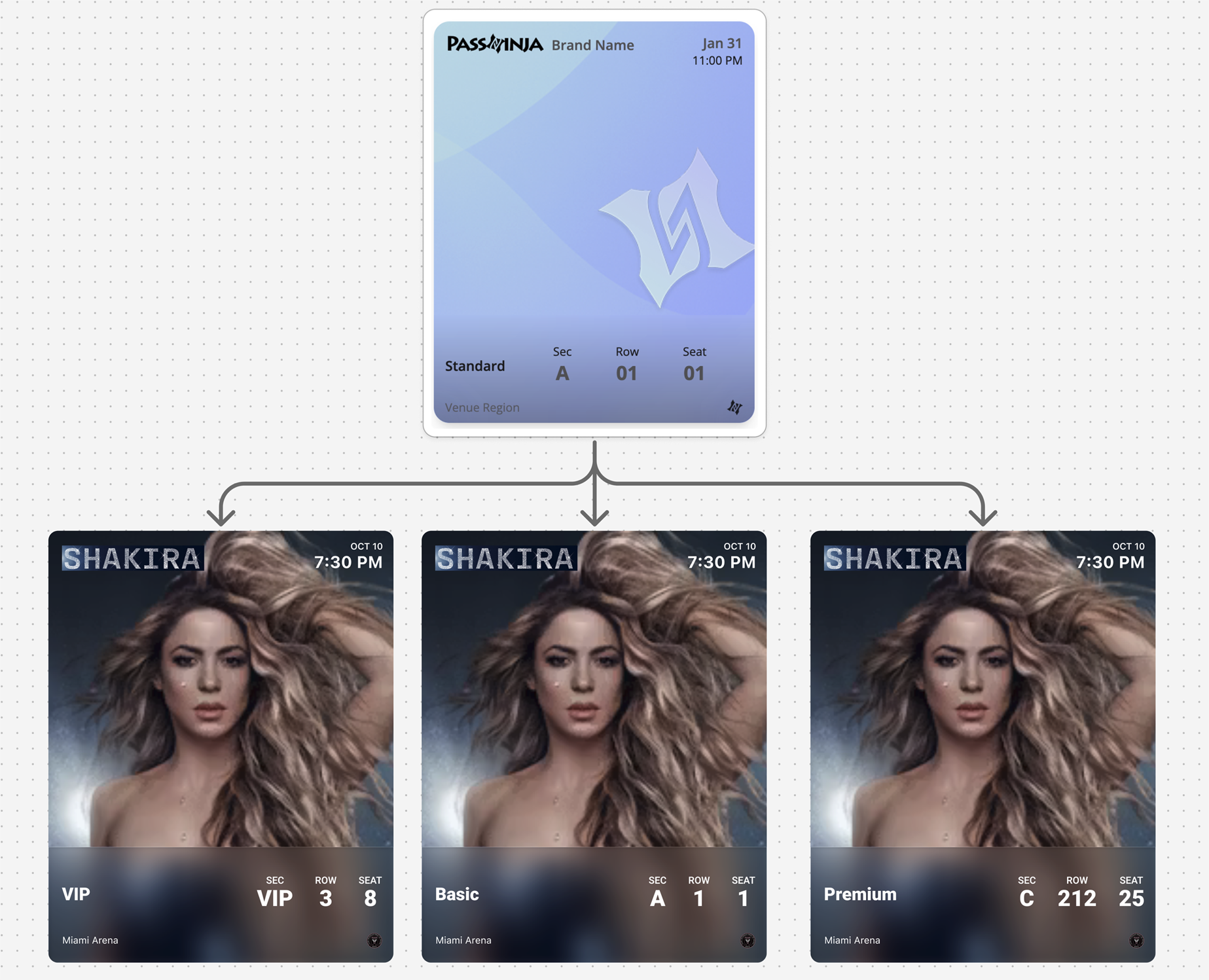
| Layer | Purpose | Design Priority |
|---|---|---|
| Entry Layer | Gate throughput | Speed and clarity above all |
| Companion Layer | Pre-event guidance | Helpful but never essential |
The Pretty Failure Trap
Enhanced tickets fail when teams design posters instead of tickets.
The artwork is stunning. The hero image is perfect. The visual experience is immersive.
But at the gate:
- "Where's the barcode?"
- "Can you scroll down?"
- "I can't scan this"
Visual richness that undermines clarity is architectural failure.
Design the entry layer first. Only then add visual richness.
Event Guide Content
Standard event tickets handle entry well. But attendees have questions before they reach the gate:
- What time do doors open versus show time?
- Which entrance should I use?
- What can I bring? What's prohibited?
- How do I get there? Where do I park?
Enhanced tickets answer these questions within the pass itself, reducing support load and improving the attendee experience.
Timing clarity:
- Doors open time versus show time (clearly separated)
- Schedule for multi-act events
Arrival guidance:
- Gate and entry instructions
- Parking information
- Public transit options
Venue information:
- Venue map link
- "What to bring / what not to bring"
- Accessibility information
Support resources:
- "How to transfer / share" policy link
- Emergency contact / help link
- Box office phone number
A bad event guide is a marketing feed, sponsor wall, or long-form reading experience. If it's needed for validation, it belongs in the entry layer, not the guide.
The Trust Gradient
Enhanced layouts can tempt visual complexity. The trust gradient keeps design focused:
- Most important information is simplest — credential, status, date/time
- Decorative elements stay behind the meaning — images support, never compete
- The pass always looks official — never like an advertisement
Apply this gradient consistently. The deeper into the companion layer, the more room for visual richness. The entry layer stays clean and fast.
Backwards Compatibility
Not all users will see the enhanced layout. Older devices, different OS versions, and various wallet implementations may show only the standard view.
Design so that:
- The core ticket works completely in standard layout
- Enhanced content adds value where supported
- Nothing critical is exclusive to the enhanced layer
Test your ticket on devices that do not support enhanced features. If the core experience breaks, your backwards compatibility has failed.
Update Opportunities
Enhanced tickets can become a "pre-event companion" with strategically timed updates:
High-value updates:
- Schedule changes
- Gate changes
- Last-mile messaging (weather alerts, timing adjustments, arrival guidance)
- Dynamic "what's next" state progression: "Doors open" → "Show started" → "Post-event"
Updates to avoid:
- Promotional noise
- Sponsor content pushes
- Anything that trains users to ignore notifications
The enhanced layer gives you more space for updates, but restraint remains essential. Every update should feel helpful, not interruptive.
Platform Reality
Both platforms enforce structure — but they behave differently:
Apple Wallet: iOS 18 introduced poster-style enhanced tickets with significantly more visual real estate. The layout remains consistent. Visual elements are integrated into the structure. The system preserves hierarchy.
Google Wallet: Hero images and expandable detail sections. The template is called a "Class." The system adapts — the same data may render differently depending on context.
| Feature | Apple Wallet | Google Wallet |
|---|---|---|
| Enhanced support | iOS 18+ poster style | Hero images, expandable details |
| Image prominence | Full poster artwork possible | Hero image area |
| Additional fields | Event guide sections | Details modules |
| Fallback behavior | Standard eventTicket layout | Standard ticket display |
Both require designing for graceful fallback on older versions. Experience enhances the system — it does not replace it.
Common Mistakes
Poster art competing with credential — The artwork is gorgeous, but the barcode is lost. Entry layer always wins.
Critical info only in enhanced views — Gate time is in the guide section, not visible on fallback devices. Never.
A "mini app" inside the ticket — Too many interactive elements. The ticket becomes confusing rather than helpful.
Too many links — Links are escape hatches, not navigation. Three to five links maximum.
Ignoring the fallback experience — Designed for enhanced, forgot that half of users see standard. Always test both.
Relying on visuals to communicate essential information — If a user needs to look twice to understand a ticket, the design has already failed.
Assuming consistent rendering across devices — Different devices, different results. Design for the minimum.
The Shift
Stop designing enhanced tickets as better-looking tickets. Start designing them as two-layer systems.
The best enhanced tickets don't add experience. They multiply clarity.
The event feels real before it happens. The venue is unmistakable. The anticipation builds.
And at the entrance? The scan is instant. The staff doesn't hesitate. The experience served the function.
That is the design that survives.
More articles in Pass Type Design
A person approaches the door at 2AM. The guard looks at the screen. The pass is unclear. The guar...
Designing Coupons, Offers & VouchersA coupon that arrives late does not exist.
Designing Event TicketsEvent tickets are context-bound. The context is the event.
Designing Gift Card PassesA gift card isn't just stored value. It's a gift someone chose.
Designing Identity PassesIdentity passes prove who someone is. They don't grant access, trigger actions, or validate trans...
Designing Loyalty PassesLoyalty programs don't fail because they lack rewards. They fail because they disappear at the ex...
Designing Membership PassesA membership pass must survive the front desk moment — with untrained staff, busy lines, and memb...
Designing Stored Value & Balance PassesStored value passes track units — sessions, visits, credits, punches, rides, meals.