
Updated March 26, 2026
TL;DR: Event tickets are context-bound. Design for the 3-second gate scan.
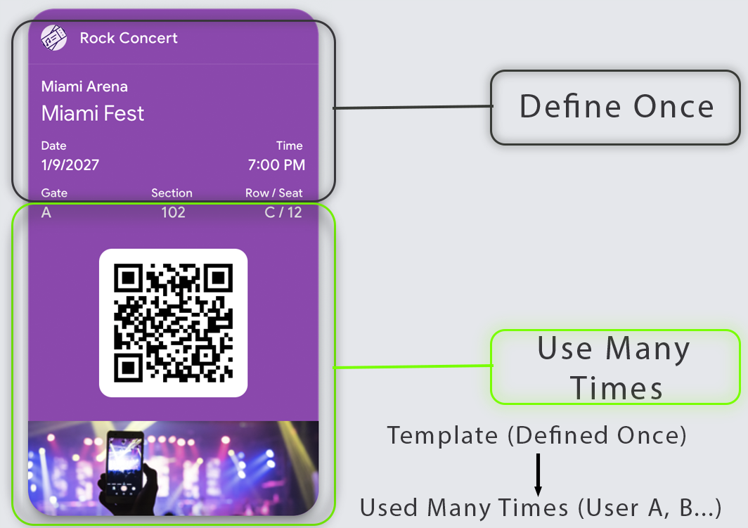
- One event = one template. The event is fixed. Only the attendee changes.
- Two users: attendees need confidence, validators need instant decisions
- The barcode must be visible without taps, scrolls, or explanations
- One dominant truth: VALID NOW, NOT YET, ALREADY USED, or EXPIRED
- Disputes at the gate are the quiet killer — design to prevent them
Why Event Tickets Break
Event tickets are context-bound. The context is the event.
Every team that ignores this fails.
They design one ticket template. They try to reuse it. And they break every system they touch.
Not because of technology. Because of architecture.
A ticket is not a reusable asset. It is a fixed pointer to a specific moment in time.
The concert venue failure
Imagine a concert ticket that shows "Main Stage" for one event and "Side Room" for another.
Now imagine the barcode fails because the venue mapping is wrong.
This is what happens when you treat event data as dynamic. The ticket doesn't know which event it belongs to. Neither does the scanner.
The ticket is not the product
The event is the product. The ticket is just access to it.
This distinction is not philosophical — it is structural. It determines what can change, what cannot, and how the system behaves at scale.
The Architecture
Event tickets don't scale across events — they scale across people.
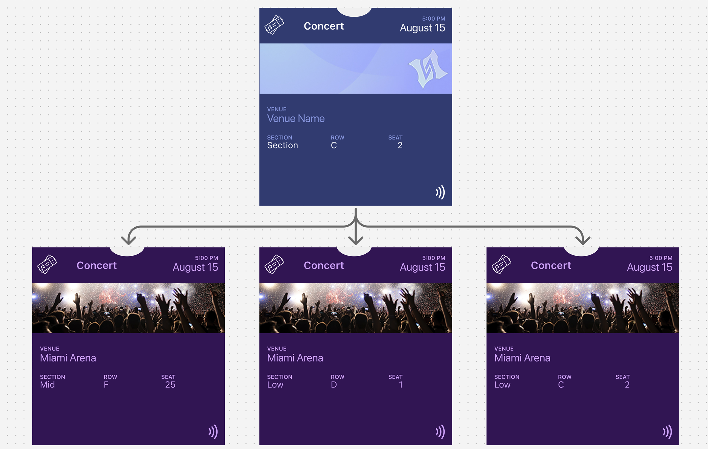
The two layers
Event (Fixed)
- Name
- Venue
- Date and time
- Event identity
Ticket (Variable)
- Seat (section, row, seat)
- Ticket holder
- Barcode / ID
- Status (valid, used, transferred)
One event, many tickets. One structure, multiple attendees. Only user-specific data changes.
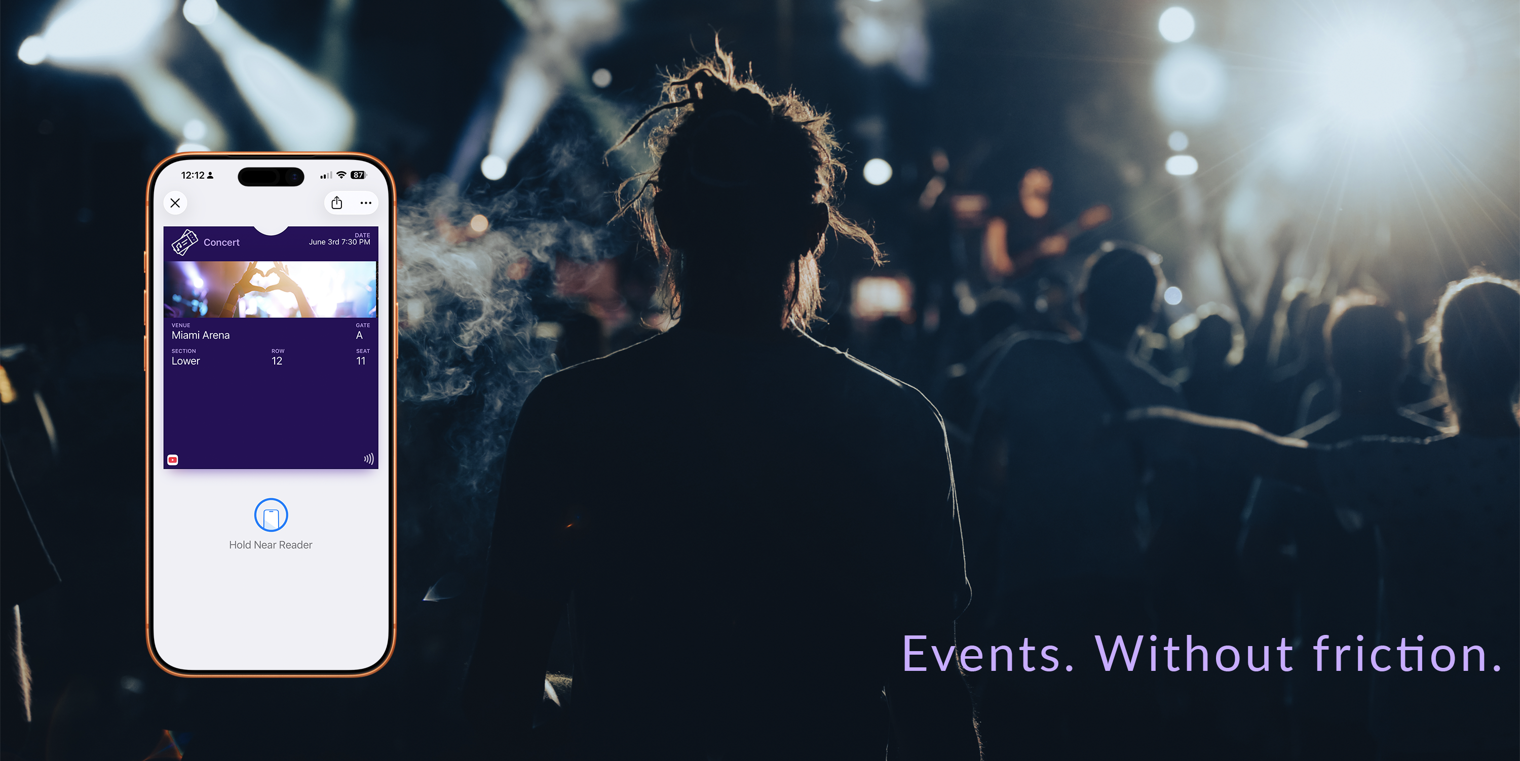
The Gate Moment
8pm. Stadium entrance. Thousands of fans streaming in.
A validator scans 10 tickets per minute. They have less than 6 seconds per person.
In those seconds, they must know:
- Is this ticket for tonight?
- Is this person allowed in?
- Which gate should they use?
If your ticket design requires reading, interpreting, or questioning — the line stops. One hesitation multiplies into hundreds of delayed entries.
Every design decision exists for this moment.
Two Users, One Ticket
Every event ticket serves two people simultaneously:
- The attendee — needs confidence they have the right ticket and can find their seat
- The validator — needs to make an allow/deny decision in under one second
Your design must reduce friction for both. Every element on the primary view must help the validator decide instantly.
| User | Primary Need | Design Implication |
|---|---|---|
| Attendee | Confidence and wayfinding | Clear event name, date, seat info |
| Validator | Instant decision | Scannable credential, obvious validity |
The Dominant Truth
Pick one dominant truth. Your ticket should answer exactly one question at a glance:
- VALID NOW — ready for entry
- NOT VALID YET — event hasn't started
- ALREADY USED — entry consumed
- EXPIRED / INVALID — cannot enter
Everything else on the ticket is supporting evidence.
QR Codes vs NFC
The validation method shapes the entire design.
QR/Barcode tickets:
- Most universal for venues and staffing models
- Work with commodity scanners
- Most sensitive to visual design mistakes
- Require native rendering (never embed in decorative images)
- Need high contrast and adequate quiet space around the code
NFC tickets:
- Fastest line flow when hardware supports it
- Lower "aiming" friction than QR
- Require ecosystem alignment (readers + configuration)
- Must communicate "Tap" clearly
- Always need a fallback credential when tap fails
Design your primary validation method first, then add fallbacks.
Scan Ergonomics
Before designing visuals, understand the physical reality:
Scanner distance and angle — Is it a desk scan (pass flat) or handheld scan (pass vertical)?
Staff workflow — Do staff scan first or ask for name first?
Offline mode — What happens when the backend is unreachable?
Brightness conditions — Night venue with dim screens? Daytime stadium with glare?
Multi-lane entry — Do all lanes have the same scanning capability?
Design that ignores ergonomics creates "pretty failure" — tickets that look great in mockups but fail in practice.
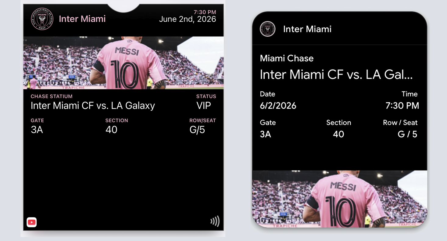
The Primary View
| Element | Priority | Rationale |
|---|---|---|
| Credential (QR/barcode/NFC) | Critical | The entire reason the pass exists |
| Event name | Critical | Confirms correct ticket |
| Date/time | Critical | Reduces ambiguity at entry |
| Gate/zone/section | High | Affects routing decisions |
| Attendee name | Medium | Helps when scanning fails |
| Seat | Medium | Useful for disputes, not visual focus |
Move to secondary/back: Terms, venue policies, long instructions, sponsor content.
Dispute Reducers
Gate disputes don't just slow lines. They embarrass customers in public, put staff in confrontations, and generate refund requests.
The dispute reducer: Add one unambiguous element that staff can point to: "See, it says Sunday, 7pm, Section 104."
When the ticket speaks for itself, disputes end before they start.
Include:
- A clear status label ("Admits 1" or "VIP Access")
- An unambiguous date and time window
- A staff-friendly identifier (not a 32-character serial)
When to Update
Update for reality, not marketing:
- Gate changed
- Time changed
- Seat changed
- Access upgraded
- Checked-in / used state
Never use ticket updates to push promotional content — users will learn to ignore all updates, including critical ones.
Platform Reality
Both platforms enforce the "one event = one template" architecture:
Apple Wallet: The layout is predefined. Event information is embedded. Each ticket is an instance of that template.
Google Wallet: The template is called a "Class." Every ticket inherits from it. The template does not change per attendee.
| Feature | Apple Wallet | Google Wallet |
|---|---|---|
| Pass type | eventTicket | EventTicketObject |
| Barcode visibility | Always visible in credential zone | "Show code" tap required |
| Time-based surfacing | relevantDate field | dateTime fields |
| Location surfacing | locations array | venue location |
| Image prominence | Strip image (moderate) | Hero image (prominent) |
Set relevant dates so tickets surface automatically as events approach.
Common Mistakes
Embedding QR codes in decorative images — Breaks scanning reliability. Always use native barcode fields.
Hiding credentials behind taps — The barcode must be visible immediately when the pass opens.
Turning the primary view into a poster — Art is nice; throughput is essential.
Making staff read paragraphs — If validation requires reading, you've failed.
No relevant date set — The ticket never surfaces automatically.
Ignoring the "used" state — Tickets that look identical before and after entry cause re-entry disputes.
Trying to reuse templates across events — Each event requires its own template. That's not a limitation. That's the architecture.
The Shift
Stop designing tickets for wallets. Start designing tickets for gates.
The gate doesn't care about your branding. It sees one thing: can this person enter?
Design for that question. Everything else is decoration.
More articles in Pass Type Design
A person approaches the door at 2AM. The guard looks at the screen. The pass is unclear. The guar...
Designing Coupons, Offers & VouchersA coupon that arrives late does not exist.
Designing Gift Card PassesA gift card isn't just stored value. It's a gift someone chose.
Designing Identity PassesIdentity passes prove who someone is. They don't grant access, trigger actions, or validate trans...
Designing Loyalty PassesLoyalty programs don't fail because they lack rewards. They fail because they disappear at the ex...
Designing Membership PassesA membership pass must survive the front desk moment — with untrained staff, busy lines, and memb...
Designing Poster / Enhanced Event TicketsEvery creative team asks the same question:
Designing Stored Value & Balance PassesStored value passes track units — sessions, visits, credits, punches, rides, meals.